research portfolio
Researcher: Product design, User Experience (UX), Perceptions, Attitudes, Decisions, User/Consumer Behaviors
Expert: Science communication, Translating data into actionable insights, Tailoring and implementing solutions based in empirical findings
Knowledge Domains

EXPERTISE AREAS
I would describe my interdisciplinary expertise as largely connecting across dimensions of Media and Communication, Design Thinking, and Decision-making and Human Behavior.
UX Research | Product Usability Testing | Decision Making | Behavioral Science | Cognitive Design-Thinking | Communication | Media Psychology | Visualization Design | Science, Environment, Risk, Health, and Policy

Communication and Media
Designing powerful communication to reach target audiences through optimal media channels; evaluating communication strategies, and improving messaging impacts.
Visual communication
Message framing and testing
Media use and effects
Science communication
Risk communication
Environmental communication
Health communication
Persuasive communication
Narrative storytelling
Media technologies (AI, AR/VR)
Digital communication
Social marketing campaigns

Design Thinking
Applying theories and principles of human-centered design thinking to diagnose and evaluate design wins and usability challenges.
User Experience Research (UXR) (UXDR)
User Perceptions
Product Usability and User Interface (UIR)
Visualization Design
Product Design Testing
Design Usability Challenges
Human-centered Design
Communication Design
Message / Campaign Design
User-centered Design
Design justice principles
Information architecture
Choice architecture

Decisions and Behaviors
Using evidence from cognitive, decision and behavioral science research to inform and improve communication design, product performances, and client KPIs.
Psychological information processing
Heuristic evaluations
Decision making
Audience analytics
User engagement studies
Consumer behavior research
Behavior change campaigns
Behavior change communication
Decision support product design
Cognitive principles and theories
Visualization design rooted in decision and cognitive science
Behavioral science insights
Research-to-Operations Framework
Diagnose
Redesigns or Modifications
Empirical Testing
Primary data collection and analysis
A / B Tests
User testing
Control / Treatment Tests
Mixed method designs (surveys, experiments, focus groups, interviews, think-out-louds, etc.)
Synthesizing and Contextualizing Results
Making Data and Evidence-backed Recommendations
Framework in action
research-driven projects and products
Step 1: DIAGNOSING hydrological forecast visualizations for the National Weather Service
Using social science research and best practices in visualization design, communication and decision sciences, and cognitive psychology to diagnose usability and understandability challenges with decision support tools such as forecast visualizations showing high flow magnitude in instances of flooding.
The images below are only for representation purposes as these product designs are yet to be finalized.

The diagnostic stage often involves doing a run-through of a product as a user and identifying potential design pain points that could influence decision-making.
For example, the ‘exceedance probability’ scale used in the map above does not use consistent and equal intervals which can create interpretation challenges.

Rainbow color scales are still being commonly used in geo-spatial visualizations despite substantial research on how ineffective and confusing they are.
Most people generally associate the color red with the ‘worst case’ or most extreme scenario indicative of the highest danger. Using ‘red’ to denote ‘moderate flooding’, therefore, can be easily misinterpreted and can draw attention away from the purple being used to denote major flooding.
Using green as a warning color to show flood warnings is counterintuitive and may not get users to perform the behaviors expected during a hazardous event such as a flood. Design choices, therefore, must be simple, intuitive, and deliberate.
SAMPLES OF OTHER DECISION SUPPORT PRODUCTS DIAGNOSED:

Running diagnostics on communication, data, and decision support products or tools begins with identifying pain points that can then be prioritized for modifying and improving, while also identifying the necessary trade-offs that need to be made.

Step 2: REDESIGNING / MODIFYING hydrological forecast visualizations for NOAA
National Water Prediction Service
NOAA - NWS are developing a hydrologic decision support mapping tool called the National Water Prediction Service which is intended to be a substantial upgrade to an existing tool. I was fortunate enough to work with an incredible team of hydrologists and scientists at the Office of Water Prediction and NWS.
Situation: NOAA NWS needs a new interface. The image below was their original landing page for this under-development interactive map.
Task: They needed us to run a social science diagnostic on this and identify potential pitfalls and pain points that could impede the usability of the product and hamper accurate interpretations of the rich information in contains.
Action: I worked with my colleagues to diagnose design elements that can be potential pain points for users - such as the use of non-intuitive defaults to auto-populate the thousands of green dots that show gauges with no flooding; and using deliberate design choices to draw users’ attention to the priority information such as the data points that indicate major flooding or other severe forecasted hazardous conditions.
Result: I designed a toolkit to clearly and efficiently communicate the findings from our diagnostic evaluation alongside science-based recommended modifications. The second image below shows a cleaner UI, a de-cluttered landing page, and a clever use of defaults to highlight the most important information while still allowing users to activate layers that reveal other data that supplements decision-making.

The BEFORE - a cluttered landing page that is confusing and overwhelming to navigate, potentially inducing cognitive overload.

THE AFTER - integrating the expertise of applied social scientists to improve the usability and overall UI of the tool.
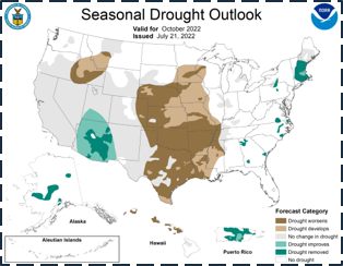
U.S. Drought Outlooks
Step 3: EMPIRICAL TESTING of forecast visualizations for NOAA Climate Prediction Center (CPC)
Situation: The NOAA Climate Prediction Center (CPC) publishes monthly and seasonal drought forecast visualizations which support decisions across multiple sectors such as agriculture, shipping, transportation, resource management, emergency management, etc.
Task: CPC wants to know how they can improve the design of their US Drought Outlooks so that they can be made more intuitive and have an updated look to them.
Action: I led a workshop for our CPC partners at the NOAA office in Maryland in 2023. My first action was to get them to identify what the key message they want to communicate through the Drought Outlook forecasts was. From focus groups and interviews, we had already run a diagnostic evaluation on these products to reveal that some of the primary pain points were the colors and legend categories being used. My control / treatment or A/B testing therefore focused on designing a survey-experiment such that the survey could measure user preferences while the experiment could specifically identify the precise design modifications that are causing statistically significant improvements in product usability and understandability.

The original US Drought Outlook forecast visualization

A comparative side-by-side look at the different legends designed for the Drought Outlooks to be tested empirically.


Each of the three designs above represents an experimental graphic modification we will be testing before synthesizing results and providing evidence-based recommendations to NOAA CPC and NIDIS on which design modifications they should operationalize and why.

Affiliations
Decision Scientist and Postdoctoral Fellow,
Institute on the Environment
University of Minnesota
partners and funding agencies